Sunday, December 6, 2009

Final lab: Census 2k

Here are 3 of the census maps for this lab:


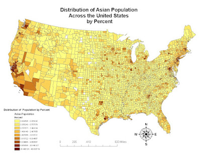
First, we have here a map of the distribution of the Asian population across the United States (by percentage, not by raw numbers). I have broken down the shadings into 9 different intervals, ranging from values between 0% and 46%. From looking at the map, we can see a clear clustering of the population along the coasts, east and west, but mainly the west. Also we can see the greatest clustering/concentration of the Asian population in the Bay Area California. The next few great populations are also around LA county and up in Washington state near Oregon. Also there is a high population on the east coast, and a surprising high concentration in Texas. We can also tell that there is a higher concentration around the cities and that the Midwest and the non-coastal states have very low populations of Asians. We could attribute the concentration on the coasts to either old immigration trends --people always come to the coast, the California railroad system used a great many number of Asian workers, or perhaps it is due to the more liberal makeup of the coasts.
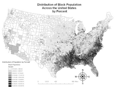

Now here is a map of the distribution of the Black population across the United States (by percentage, again). Again, I have broken down the percentage values into 9 intervals, ranging in values from 0% to 86%. We can see that this map is much different than the previous one. The majority concentrations are no longer on the coasts but mainly in the South. Also the only other place with the highest concentration of the population we can see is a small county in Michigan, which may indeed be Detroit. We can see the concentration pan out from the south, with the heart of the concentration in the middle of south panning out, until by the time we reach the Midwest and until we hit California, the population is at the lowest possible range, with no variance (not like the Asian map). We can perhaps attribute the concentration of the population in the South to the fact that the majority of African - Americans arrived in this country because of the slave trade which put them on plantations and the like in the South. Though we have moved past this, it is interesting to see that the concentration remains mainly in the original area, and in fact creates a fairly exact outline of the Confederate states.
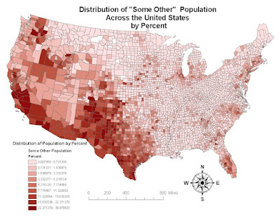

And finally here, we have a map of the distributions of "some other" population by percentage across the country, again divided into 9 intervals, this time ranging from values between 0% and 39%. This time we can see that the concentration of the population is in the west coast and doesn't really go out further past Texas. We can see here that the greatest percentages are in the central valley of California, as well as in Texas and New Mexico which leads me to believe that this "some other" population is Hispanic or Latino. Many Latinos have immigrated to the US in hopes of a better life and often end up working menial jobs for hours on end, often picking fruit and vegetables in the central valley, the main evidence for my hypothesis. Also, the fact that there is a great concentration of the population along the South-west border of the country (which borders Mexico) is another reason why I reached my hypothesis.


So in all, after the creation and analysis of these maps, it's very interesting, and fairly easy to see how perhaps historical, economic, and immigration factors have influenced the distribution of the Asian, Black and "other" (Latino/Hispanic) population across the United States. In all three cases we can see how these populations originally came into the country (and not under the best circumstances either)- to the west coast cities, the South, and to the West in general. Also we can see that even since their arrival, the most concentrated areas of their population have not moved far. The results leave much more to be investigated and asked, but gives a good starting point for inquiries into the spread of the population, wonder if the 2010 census will look much different!

GIS is indeed a useful tool and I am glad to be at least partially aware of how much power it is capable of and how easy it is to manipulate the data, which can indeed be misleading or eyeopening. For example, the results would be similar but skewed if we based the maps on raw population rather than percent, especially given the different populations of counties. The software that we used for this class, ArcGIS, however was quite difficult to maneuver and I feel like it takes a great deal of training and practice to master it. And so, GIS is indeed a great tool despite the technical difficulties, and is a great skill that helps transform raw data into understandable visuals that can teach us a great deal.


Friday, November 27, 2009

Lab 7: LA Station Fires

Above I have two maps, one is a reference map of Los Angeles county, with a hill shade of the region, along with the major highway and road system mapped out in white, with the area of the 2009 station fires outlined (each outline represents a day of the fire, starting August 29th going through September 2nd.) The second map is more zoomed in towards the fires, with the slope of the area shaded. The outline colors of the fire were changed because the orignial colors were difficult to tell apart from the slope colors, with red being the highest slope and green being the flattest.

The Station fire which we are focusing on, took place in Northern LA county, and burned around 160,000 acres and began in late August and continued through October (due to some rainfall) and ended up be coming the 10th largest in California history. As the fire grew, it came to threaten nearby Pasadena, La Crescenta, Glendale, La Canada Flintredge, and Altadena to just name a few. Mandatory evacuations were initially imposed, but by the end of the first week of September, the residents were allowed to return back home.(Wikipedia) To many, the fire seemed surreal, with photos capturing images that looked not of this world, some even compared it to the hellish realm of "Mordor" in the Lord of the Rings for it's unending flames that continued into the night. (boingboing.net) Though the origins of the fire were intially unknown, it was discovered that arson may have been the cause. (Wikipedia, Inciweb).

Slope is one of several factors (among altitude, solar exposition, and overall surroundings) which determines the type of climate, vegetation cover, and wind pattern. According to Viegas' article slope is "the main topography element affecting directly the fire propagation." The rate of the fire climbing increases the larger the slope (2910). And this theory is tested to be true; if we examine my map more closely we can see that indeed the fire grows in the direction of the slope, and from the articles I have read and what I heard on the news, it grew at an astounding pace.

So if we examine my second map more closely, we can see that the first ring of fire begins on an area of relatively high slope (it's not green- its red/orange/yellow), and as the fire increases, it increases in the direction the slope is going (North), and heads in that direction, it does not head south, were the slope is minimal and relatively flat (green), but towards the hills where the slope is going up, and the fire continues to the climb upwards along this slope. I imagine that if the fire were not contained that it would continue to climb upwards, and eventually pan out laterally, to the other few areas of high slope and climb over those foothills too.

And so we can see that slope is one of the major aspects of the propagation of this Los Angeles Station Fire, and that the evidence shows us that indeed the fire followed the slope of the mountains in its course. And though it is not the reason the fire started or the only reason the fire grew so quickly (chapparal also played a great role), slope can definitely help us predict where the fire is going to spread next.


Downloads from:
http://gis.ats.ucla.edu/ (LA county, highways)
http://gis.lacounty.gov/eGIS/?p=1055 (Station fires)


Information From:
"2009 California Wildfires" http://en.wikipedia.org/wiki/2009_California_wildfires. 12/1/2009


"All Station Fire Perimeters". Los Angeles County Enterprise GIS. 9/02/09. http://gis.lacounty.gov/eGIS/?p=1055. 12/1/09.

"Incident Overview. " Incident Information Web. http://inciweb.org/incident/1856/. 12/1/2009.

"2 Firefighters Die as Los Angeles Wildfire Rages" http://www.nytimes.com/2009/08/31/us/31fires.html. 12/1/2009


" Straight Outta Mordor: Notes from the LA Fire"
http://www.boingboing.net/2009/09/01/straight-outta-mordo.html?utm_source=feedburner&utm_medium=feed&utm_campaign=Feed%3A+boingboing%2FiBag+%28Boing+Boing%29. 12/1/2009

Viegas, Domingos Xavier. "Fire Dynamics" Philosophical Transactions: Mathematical, Physical and Engineering Sciences, Vol. 356, No. 1748, The Royal Society(Dec. 15, 1998), pp. 2907-2928

Thursday, November 19, 2009

Lab 6: DEMs!

1) For this Lab I chose as my area of interest Lake Tahoe and it's surrounding shores in California/Nevada in the United States, a place where I visit in the winter fairly often. I felt that it would be interesting to see the great disparity between the still surface of a lake (or even if it was represented as flat in an elevation model) and the huge mountain ranges surrounding it. The DEM that I obtained from the USGS site uses the North American GCS from 1983, and the extent of the DEM is (approximately) Top: 39.256 decimal degrees, Left: -120.343 decimal degrees, Right: -119.801 decimal degrees, and Bottom: 38.880 decimal degrees.

2) Shaded Relief Model

3) Slope Map

4) Aspect Map

5) 3D Image

Thursday, November 12, 2009

Lab 5 Projections!


Undoubtedly map projections are extremely important in not only the world of geography, but also any time maps are used. Representing the spherical earth onto a 2D plane is no simple task, and it is essential to be precise and exact in one's conversions in measurements so as to best represent the world. By allowing us to represent the Earth's surface in 2D, projections allow us to explore the world by simply looking at a map or a computer screen, both mediums which (obviously) require the world to be "flat" since these are much more portable and convenient than carrying around a globe.

What I never knew before this class was that there were so many different types of map projections with a variety of representations, some of which I find nearly unreadable (such as the equal area Bonne map I have created above). One goes about choosing a projection based upon what one wishes to accomplish: navigation, radio and seismic mapping are just a few of the things one could base their decision on. Obviously one would want to have a map best suited to one's particular needs.

For example, in conformal map projections (such as the Mercator and Gall-Stereographic I created) preserves the angles of the map, and has rhumb lines (a straight line on the projection) which show true direction, and would help a navigator see that he could reach a certain point if he keeps a constant bearing. Equidistant projections maintain the true distances from the center of the projection (such as in Plate Caree and Sinusoidal) which is great if one is interested in measuring things in relation to the center. In equal area projections, (Bonne and Molleweide), the areas of the Earth's surface are maintained at a smaller scale and not distorted.

But just are there are advantages to having these different projections to represent the maps differently, there are also disadvantages. What if one has all these options but is no expert in GIS? How does one choose which projection? As we can see, distance is most definitely not constant across all maps -- the distance measured between Washington DC and Kabul is different in every single projection, with great differences between them (even of the same projection!). So really without sure knowledge, one leaves it up to some ambiguous authority (Google maps, map quest, the USGS etc) to determine which projection you are to see. Also, without knowledge of which map is appropriate for which usage, one may not be able to determine the precise and correct measurement they are seeking.

And so, though there is some uncertainty involved and danger in choosing one projection over another without knowing potential distortions, having projections is of great use to us where GIS, maps, and GPS are all presented in 2D, and we can't all walk around with globes.

Friday, November 6, 2009

Lab 4


This week I had my first ever experience with the professional mapping program Arc Map. Not only was I overwhelmed and excited at the amount of buttons and things one could create but also (as a Computer Science major) amazed and in awe in how much work and effort must have gone into creating this program. Initially it was really cool to be doing all this stuff, but I must admit as I was stepping through the tutorial I was continual frustrated as I seemed to be having more problems linking things than actually using the program!


My experience was mainly a positive one since I'm fairly computer savvy and the tutorial was pretty clear. However my biggest problem occured in Exercise 3, when we are supposed to "Add Field" to the Attribute table of Tracts. For some reason I kept getting this message that I did not have permission to access something or other and so I couldn't create that data frame. Eventually I got it working after much frustration and moving around of files, but everything else was straightforward with the instructions, but the thought of having to actually make up these maps on my own is rather daunting.

ArcMap is a great tool to be able to pull data together and figure out the overlap and put everything in one visual form. You can see clearly what falls within the noise contour in our example (assuming the data is correct) and though time consuming, is probably much faster than back in the day when everyone had to draw the maps by hand and allows for easy overlapping and organization of data for each component.

However, like any other craft, ArcMap takes time to master and many hours logged at the computer in order for one to be as efficient and clear as possible, considering there are so many buttons, tables, etc etc that are at one's disposal. So though a great tool, it is not an easy one to learn. Also, as easy as it is to present data, it must be equally easy to misrepresent data (like any map) and therefore confuse the audience with your message and not necessarily the facts. Also, it was so easy to just accidentally move something too far or too close, so I imagine one has to be very careful when using the program on a regular basis.


Friday, October 23, 2009

LAb 3 - Neography - where all my favorite books take place


View My Favorite Books in a larger map

So I found using My Google Maps to be extremely easy to use, and the problem was not using it but rather of thinking things to put on the map!
I eventually decided to try to post locations of where my favorite books took place, which was an interesting project for me personally
as well since I could see in which areas of the world my literature focused on.

Neography as a whole can be very useful, especially when one is in an unfamiliar area or would like to create a visual representation of something
in the world that one cannot find a source of already. This allows for improvement and frequent updates by the people who know areas best. This allows
for easier travel planning and adventuring in areas with which you are unfamiliar or which you wish to discover something new. Also, it is much easier and
cheaper to access a map on the internet, which is the main way that neography is accessed, with this greater ease, people may locate things on the fly,
and quickly find anything they need - drugstores, points of interests, etc. and also it is cheaper than buying a map or travel guide for every area where
one would like to visit.

However, like most open sources of information on the internet, neography can be easily skewed and lead to misinformation. Without a strict authority checking
to make sure if the sources are indeed placed where it is correct, things may indeed be misrepresented. Also, it is easy to map private information that though available
on the internet already, may not have been looked at before put on a map (such as the Prop 8 map we saw in lecture). Also, by simply by leaving out points or adding too many
you can make the data appear in one or another.

Wednesday, October 14, 2009

Lab 2: USGS Topographic Maps


1. What is the name of the quadrangle?
Beverly Hills Quadrangle

2. What are the names of the adjacent quadrangles?
Canoga Park, Van Nuys, Burbank, Topanga, Hollywood , Venice, Inglewood

3. When was the quadrangle first created?
1966

4. What datum was used to create your map?
North American Datum 1983 (updated from 1927), and the National Geodetic Vertical Datum 1929

5. What is the scale of the map?
1: 24,000

6. At the above scale, answer the following:

a) 5 centimeters on the map is equivalent to how many meters on the ground?
5 cm --> 120, 000 cm --> 1,200 M

b) 5 inches on the map is equivalent to how many miles on the ground?
5 in --> 120,000 in --> 10,000 ft -->~1.89 mi

c) one mile on the ground is equivalent to how many inches on the map?
1 mi -->5280 ft --> 63360 in (total) --> 2.64 in (on the map)

d) three kilometers on the ground is equivalent to how many centimeters on the map?
3 km --> 3000 M --> 300,000 cm (total) --> 12.5 cm (on the map)

7. What is the contour interval on your map?
20 Feet

8. What are the approximate geographic coordinates in both degrees/minutes/seconds and decimal degrees of:

a) the Public Affairs Building;
34∘ 4'30" (32.75∘) and 118∘26'15" (118.4375∘)

b) the tip of Santa Monica pier;

34∘ 32" (34.0089
) and 118 ∘30" (118.5∘)
c) the Upper Franklin Canyon Reservoir;
34
7'10" (34.1194) and 118 24' 30" (118.408)

9. What is the approximate elevation in both feet and meters of:

a) Greystone Mansion (in Greystone Park); 570 ft (173.7 meters)

b) Woodlawn Cemetery; 135 ft (41.15 meters)

c) Crestwood Hills Park; 710 ft (216.4 meters)

10. What is the UTM zone of the map?
Zone 11

11. What are the UTM coordinates for the lower left corner of your map
3763000 Northing and 361100E


12. How many square meters are contained within each cell (square) of the UTM gridlines?
1,000,000 sq meters (1000 by 1000 meters)

13.


14. What is the magnetic declination of the map?
Magnetic N - Geographic N = 13
∘12"
15. In which direction does water flow in the intermittent stream between the 405 freeway and Stone Canyon
Reservoir?
Flows from North to South

16. Crop out (i.e., cut and paste) UCLA from the map and include it as a graphic on your blog.

Friday, October 2, 2009

Lab 1: Find 3 cool maps

Map 1: Obesity in America


This is a shot of a map that I pulled from boingboing.com, and in fact is supposed to be an animated map of obesity in America from 1985 until 2005. However, for whatever reason the link appears to be broken, but the image intact. This map defines obesity below the Key as when a person has a BMI greater than 30. I would venture to guess that this is in the 2000s, and maybe 2005, but unfortunately we can't see exactly where the bar is, but can judge by the fact that most of the states are in the orange/reds, and the later 2000s are the same color on the time line, that this map is around this time. What I find interesting about this map is that you can see that obesity is not equal across the whole US, and in fact appears to be clustered in the deep south (the most extreme cases in red, meaning that more than 25% of the population is obese), and makes its way up north and to the east, and also jumps up to Michigan. For me I expected more states with harsher winters to have greater obesity rates, such as Minnesota and the Dakotas, but I suppose the South has other factors including diet and lifestyle that have contributed to obesity in the area. Also it is intersting that the states with the lower rates of obesity (Utah, Montana, Colorado, and the New England area) are so spread apart, perhaps they have the lowest rates because they have smaller populations than the other states? or again is it other factors?

Map 2: Foreigners


I pulled this map from the National Geographic website, under the section "Earth Pulse". This map is actually interactive , and you can choose many different features to appear on this map, and one of the options (the one I chose) was % foreign born population (and this screen shot I took didn't come out very clear I'm afraid, but if you hit the link and then select the option "Percent Foregin Born" you may see it better). The areas that are the darkest shade of red (more than 15%) have the greatest percentage of foreigners in their country. It's interesting to see that Canada appears to have a higher percentage than the US, which is generally considered a melting pot of cultures! Also, Australia and New Zeland to have a high percentage as well, which I was not aware of, I know that originally when they were discovered the indigenous population was over powered by the British, but I was not aware that foreign-born people were still going over to live there. It also is very curious to see some areas that have the deep red also, such as Saudia Arabia/Gulf, but I suppose you could infer that the oil wealth there encourages internationals, or it may be in fact that its just persons from neighboring countries in the region, given the nomadic history of the region. But perhaps the most two curious cases for me are that of Kazakhstan and Gabon. I suppose Kazakhstan has oil or some other industry which attracts the foreigners, but I would need to do more research to understand why Gabon has such the highest foreign population in Africa.

Map 3: Shoes

This is a map of real time purchases from zappos.com, so while it is an interactive map, its still pretty cool to see which shoes are being bought where. From this you can learn the weather patterns of certain areas, the lifestyles, and also perhaps the purchaser's accessibility to a shoe store. Since the screen shot I've taken, I'm seeing more running shoes and sneakers being purchased on the west coast, while the East coast is stocking up on boots and heels. Also you can see in the screen shot someone from Salt lake city has bought a pair of boots and in NY someone has purchased a jacket. Also it seems that the Midwest is purchasing the most stuff as I watch the map in real time. Hopefully Zappos will compile this data soon, and one will not only be able to see the trends in fashion but also be able to judge the time of year etc.

Followers